Creating beautiful plots using matplotlib
A blog post on creating high quality visualisations of COVID-19 data.
This is just an attempt to understand and appreciate an article published on Medium. I wrote this article for my own reference, and it could have been written in a much better way!
First things first: Check your Python version
I wrote this piece on Jupyter Notebook, and downloaded the notebook file in markdown format. My Jupyter Notebook uses Python 3.6.9, and you may encounter issues running this code if your notebook is using older versions, especially Python 2.x.
You can check your Python version by running the following code in your notebook.
import sys
sys.version
'3.6.9 (default, Apr 18 2020, 01:56:04) \n[GCC 8.4.0]'
If you find that your notebook is running on Python 2.x, all you have to do is
to install Jupyter notebook again using the command pip3 install notebook.
This will be a separate installtion and doesn’t affect your current
installation.
PS: If you don’t have pip3, you can install it using the command sudo apt
install python3-pip.
Importing libraries and setting defaults
Without much further ado, let’s get started with the task.
First step is to import all the Python libraries we will require.
import pandas as pd
import matplotlib.pyplot as plt
from matplotlib.dates import DateFormatter
import matplotlib.ticker as ticker
import matplotlib
%matplotlib inline
plt.style.use('fivethirtyeight') # Plot style
matplotlib.rcParams['font.family'] = 'sans-serif'
matplotlib.rcParams['font.sans-serif'] = 'Liberation Sans' # Open sourse font closest to Helvetica

#plt.style.available Prints a list of available styles
Getting an overview of the dataset
Create the dataframe and get the column names
df = pd.read_csv('https://raw.githubusercontent.com/datasets/covid-19/master/data/countries-aggregated.csv', parse_dates=['Date'])
for i in range(len(df.columns)):
    print(str(i+1)+". "+df.columns[i])
1. Date
2. Country
3. Confirmed
4. Recovered
5. Deaths
The dataset has Confirmed, Recovered, and Death counts for different countries for different days.
Some more information
print('No. of countries: {}' .format(df['Country'].unique().shape[0]))
print('No. of days: {}' .format(df['Date'].unique().shape[0]))
print('No. of rows: {}' .format(df.index.shape[0]))
No. of countries: 188
No. of days: 116
No. of rows: 21808
That means, the dataset contains daily case count for 188 countries for 116 days. Therefore, thre are \(188 \times 116 = 21808\) rows. This number keeps changing as the database is updated everyday.
Preparing the data for plotting
The dataset contains COVID-19 data for 188 countries. Let’s say we want to
plot the case count for only a few countries, say Canada, China, France,
Germany, the US, and the United Kingdom. That means, out of the 188 countries
in the dataset, we want to pick only these six countries. The smart way to pick
only these countries is to use isin() method.
countries = ['Canada', 'China', 'France', 'Germany', 'US', 'United Kingdom']
df = df[df['Country'].isin(countries)]
#df.head(4)
isin() method returns True if a country name is found in the list
countries.
In the above code, the dateframe df is transformed to contain
only those countries whose name is in the list countries.
The total number of cases in each country on any day is the sum of confirmed,
recovered, and death cases. We find this sum for each country and record it
under the new column Cases. Summing over columns is achieved by setting the
axis parameter to columns. To sum over rows, the axis parameter should be
set to index.
df['Cases'] = df[['Confirmed', 'Recovered', 'Deaths']].sum(axis='columns')
#df[2:7]
Since we want to plot the number of cases for each country, it would be more
intuitive to have countries as columns. Also, since we want the date along the
x-axis, we can set the column Date as the index.
Both of these changes can be made in a single shot by using the pivot()
method. Note how all our requirements are passed as parameters to the
pivot() method.
df = df.pivot(index='Date', columns='Country', values='Cases')
Now, we create a copy of the dataframe for plotting purposes. This is purely a convenience and is not at all a compulsory step. The idea behind this is to keep the original dataframe untouched.
covid = df.copy(deep=True)
covid.columns = countries
#covid.tail()
copy is a method defined in the DataFrame class. It creates a copy of the
calling object. It has only one parameter called deep which is a boolean.
Default is deep=True.
If deep=True, a new object is created and both the index and the values of
the calling object are copied. This is called deep copy.
Since the new object is not linked to the calling object, changes made to the calling object are not reflected in the new object.
If deep=False, a new object is created but only the references to
index and values of the calling object are copied. The actual values of the
calling object are not copied. This is called shallow copy.
Here, in contrast to deep copy, the new object is linked to the calling object. Therefore, changes made to the calling object are reflected in the new object as well.
Useful references:
- https://dev.to/sharmapacific/assignment-vs-shallow-copy-vs-deep-copy-in-python-5c72
- https://realpython.com/copying-python-objects/
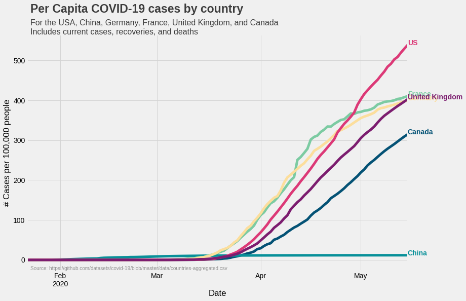
Calculating per capita cases
What we have now is the number cases in each of the six countries. However, this number doesn’t say much about the spread of infection in the country. For example, if UK and US both have 10,000 cases, the situation in the UK will be considered more serious as it’s population is less than that of the US. Therefore, a case count for a given size of population (say 100,000) is a more useful metric. This metric, called the ‘per capita’, for a particular country can be calculated by using the following formula:
\[\text{Per capita cases} = \frac{\text{No. of cases}}{\text{Country's population}} \times 100,000.\]To calculate per capita cases, we first create a dictionary containing
population data for each country. Dictionary is a good choice because
it allows us to access an element by a string (country name in our
case). We also create a copy of covid dataframe, and assign it to
to the variable percapita. Again, this is purely for our
convenience – we are plotting two graphs, and we want to keep the
corresponding data separate.
populations = {'Canada':37664517, 'Germany': 83721496 , 'United Kingdom': 67802690 , 'US': 330548815, 'France': 65239883, 'China':1438027228}
percapita = covid.copy(deep=True)
for country in list(percapita.columns):
    percapita[country] = percapita[country]/populations[country]*100000
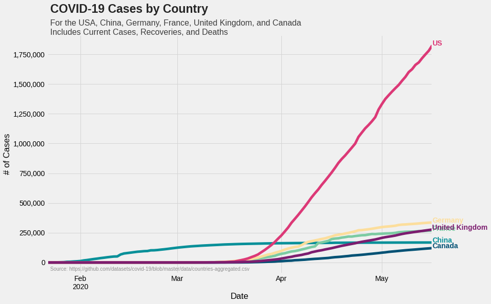
Plotting the total cases
All we have done till now is to select relevant data from a larger dataset. Let’s plot them now.
Let’s first list out what we want to do.
- Plot COVID-19 numbers for six countries
- There are two numbers for each country: total case count and per capita case count. We would like to plot them in two different graphs. That is, one graph for total case count and a different graph for per capita case count
- Each country is represented by a unique color
- The final output is an aesthetically pleasing, standalone graph with proper annotations
We can assign colors to each country using a dictionary, and use in as many graphs we want to plot. We can use hex codes to represent colors. Visit https://htmlcolorcodes.com/ for more information.
colors = {'Canada':'#045275', 'China':'#089099', 'France':'#7CCBA2', \
'Germany':'#FCDE9C', 'US':'#DC3977', 'United Kingdom':'#7C1D6F'}
fig = plt.figure(figsize=(12, 8))
ax = fig.subplots(nrows=1, ncols=1)

covid.plot(color=colors.values(), linewidth=5, ax=ax)
ax.yaxis.set_major_formatter(ticker.StrMethodFormatter('{x:,.0f}'))
ax.grid(color='#d4d4d4')
ax.set(xlabel='Date', ylabel='# of Cases')
ax.legend().set_visible(False)

#Adding country names to corresponding curves
for country in colors.keys():
    ax.text(x=covid.index[-1], y=covid[country].max(), color=colors[country], s=country, weight='bold')

#Adding header
ax.text(x=covid.index[1], y=int(covid.max().max()+(0.15*covid.max().max())), \
s='COVID-19 Cases by Country', fontsize=23, weight='bold', alpha=0.85)

ax.text(x=covid.index[1], y=int(covid.max().max()+(0.05*covid.max().max())), \
    s='For the USA, China, Germany, France, United Kingdom, and \
Canada\nIncludes Current Cases, Recoveries, and Deaths', fontsize=16, \
    alpha=0.75)

#Adding reference
ax.text(x=percapita.index[1], y=-70000, \
    s='Source: https://github.com/datasets/covid-19/blob/master/data/countries-aggregated.csv', \
    fontsize=10, alpha=0.4)

#plt.show()
#fig.savefig('covid19_total_cases.png', transparent=False, dpi=300, bbox_inches='tight')
The first step in creating a visualisation in matplotlib is to create a
Figure object. We can think of this object to correspond to the whole
figure. It is like an empty sheet on which the graph will be plotted.
Next, we will create an Axes object. This corresponds to the actual plot. The
Axes object is typically created using subplots() which are instances of
Axes class. The number of subplots in a Figure object is determined by
nrows and ncols parameters. BY default, these parameters are set to 1.
A Figure object can have many Axes objects, but a given Axes object can
only be associated with only one Figure object.
With both the Figure and Axes objects created, we are ready to plot the
data. To do this, we use the plot function defined in the DataFrame class
in pandas. Note that we haven’t mentioned what should be plotted along x and
y axes. The plot() function has considered dataframe index to be along
x-axis, and case counts to be along y-axis.
The line color for each country is taken from the dictionary colors.
colors.values() returns only the color code for each country.
In the next line, we are formating the values at each major tick mark on y-axis.
StrMethodFormatter('{x:,0f}'): The value at each tick mark is a number. We
want to add a comma at an appropriate place. This can be done by calling the
SetMethodFormatter(). In the code x represents the value that must be
formatted (it should always be x), and 0f denotes that there are no decimal
values.
Adding country names to the graph
text() method is used to add text annotations to the graph. While adding text, we have to
specify at least two things:
- Location of the text in terms of x and y coordinates
- The text to be added
Additionally, we can also add other things like color, font, font size etc.
The location of country names for each graph
We again use dictionary colors to choose the country names. Since the
country names are keys, the list of countries can be obtained by running
colors.keys(). We use the variable country to loop over the elements of
colors.keys(). Here country is just a variable name like i, j etc.
X-coordinate: covid.index[-1] – the last element of the index i.e. the right
end of the x-axis
y-coordinate: covid[country].max() - the max value for each column. i.e. the
largest case count in a day for a particulalr country. In graph, this
corresponds to the highest point in the curve.
colors[country]: Picks the color from the dictionary colors.
s=country: country name
alpha: Controls opacity
weight: a numeric value in range 0-1000, ‘ultralight’, ‘light’, ‘normal’, ‘regular’, ‘book’, ‘medium’, ‘roman’, ‘semibold’, ‘demibold’, ‘demi’, ‘bold’, ‘heavy’, ‘extra bold’, ‘black’ (copied from matplotlib documentation)
Most of these parameters are different for each country. Therefore, we use our
dictionary colors and loop over its keys (see the for loop).
Adding the header
Header should be at the top left of the figure. Also it should be well above the graph.
That is, its x-coordinate is close to the origin, and y-coordinate is beyond the maximum y-value plotted in the graph (otherwise, the text will be inside the graph area itself).
Let’s say x-coordinate is covid.index[1]. If you find it too close or too far
from the origin, then play around with the index.
Fixing the y-coordinate is a bit involved. First of all it should be more than the largest
value plotted in the graph. The largest value is obtained by covid.max().max().
This is how it works: covid.max() returns the largest values for each column in the dataframe.
covid.max().max() returns the largest among these values. In other words, we first pick the
max value for each country, and then pick the largest value from those values.
The appropriate y-coordinate is obtained by adding some margin to the largest value. By trial and error, I have found that (largest value + 15% of largest value) is a good formula to use.
Similarly, the y-coordinate of the sub-header is fixed using the formula (largest value + 5% of largest value).
Plotting per capita cases
Code for plotting per capita cases is very similar to the one which we used above. The only difference is that we are using a different dataframe.
fig1 = plt.figure(figsize=(12, 8))
ax1 = fig1.subplots()
percapita.plot(color=list(colors.values()), linewidth=5, ax=ax1)
ax1.grid(color='#d4d4d4')
ax1.set(xlabel='Date', ylabel='# Cases per 100,000 people')
ax1.legend().set_visible(False)

for country in list(colors.keys()):
    ax1.text(x=percapita.index[-1], y=percapita[country].max(), \
    color=colors[country], s=country, weight='bold')

ax1.text(x=percapita.index[1], y=(percapita.max().max() + (0.15*percapita.max().max())), s="Per Capita COVID-19 \
cases by country", fontsize=23, weight='bold', alpha=0.75)
ax1.text(x=percapita.index[1], y=(percapita.max().max() + (0.05*percapita.max().max())), s="For the USA, China,\
 Germany, France, United Kingdom, and Canada\nIncludes current cases, recoveries,\
 and deaths", fontsize=16, alpha=0.75)
ax1.text(x=percapita.index[1], y=-25,\
s='Source: https://github.com/datasets/covid-19/blob/master/data/countries-aggregated.csv',
fontsize=10, alpha=0.4)

#plt.show()
#fig1.savefig('covid1.png', transparent=False, dpi=300, bbox_inches='tight')
If you liked this post, you can share it with your followers or follow me on Twitter!