Binary classification metrics
Classification is one of the most common tasks in machine learning. As the name suggests, it involves predicting the class to which a particular instance belongs. For example, an online retailer like Amazon might have an algorithm classifying customers into different groups based on their spending habits. An algorithm on Netflix might classify viewers into different categories depending on their viewing preferences.
Binary classifiers are the simplest of classifiers – they predict whether a particular instance belongs to a class or not. For example, an algorithm that blocks videos that are not safe for kids is a binary classifier. We can also see medical diagnostic tests as binary classifiers that segregate people into ‘Infected’ and ‘Uninfected’ categories.
In this article, we learn bit about the metrics used to measure the skill of binary classifiers. We intentionally do not write any code as the goal is to understand the concepts; code can wait for a while.
We use the famous MNIST dataset containing the images of handwritten digits from 0 to 9. Each row in the dataset gives the distribution of pixel intensities in that particular image.The dataset has 70,000 rows, each labelled with the number the image represents.
The machine learning task is simple: we want the the algorithm to figure out if an image represents five or not. We do not expect it to figure out which number it represents.
After reading the article, you will be able to:
- Articulate what is binary a classifier
- Differentiate between ideal and real binary classifiers
- Articulate why accuracy is not a good performance metric for binary classifiers
- Expalin what a confusion matrix is
- Explain precision/recall tradeoff and how to deal with it
- Explain how to compare the performance of two or more classifiers
Ideal vs real binary classifiers
An ideal binary classifier segregates the samples into two groups perfectly. It makes no mistake of any kind. It’s like a medical diagnostic test that never misses an infected sample and never red flags an uninfected sample. Unfortunately, such classifiers are not like that and they are a bit messy. Fire detectors sound alarms when there is no fire, and medical tests miss to detect infections even in people who have clear symptoms of infection.
In the classification task we are considering, there are four possibilities. In fact, any binary classification task will have four possible scenarios.
- The image represents 5, and the algorithm finds it to be 5. This possibility is called true positive.
- The image represents 5, and the algorithm finds it to be ‘not 5’. This is possibility is called false negative.
- The image does not represent 5, and the algorithm finds it to be 5. This possibility is called false positive.
- The image doesn’t represent 5, and the algorithm finds it to be ‘not 5’. This possibility is called true negative.
These parameters are often represented in the form of a matrix called the confusion matrix. It is of the form:
\[\begin{equation} \begin{bmatrix} TN & FP \\ FN & TP \\ \end{bmatrix}, \end{equation}\]where \(TN\) is the number of true negatives, \(FN\) the number of false negatives, \(FP\) the number of false positives, and \(TP\) the number of true positives. For an ideal classifier, \(FP = FN = 0\).
Clearly, the confusion matrix gives a lot of information. Hence, it is useful to have metrics that are simple and derived from the confusion matrix. Some of them are:
-
False positive rate: It is the probability that a true negative is assigned a positive class. In our example, it is the probability that a non-five image is classified as five.
-
False negative rate: It is the probability that a true positive is missed by the classifier. In the classification task we are considering, it is the probability that the algorithm misses to recognise an image of 5. False negative rate is also called miss rate.
-
True positive rate: It is the probability that a true positive is classified as positive. It is the probability that an image representing 5 is classified as 5. True positive rate is also called sensitivity.
-
True negative rate: It is the probability that a true negative is classified as negative. It is the probability that an image representing a non-five integer is classified as non-five. True negative rate is also called specificity.
The formulas for calculating he above metrics are given in the table below.
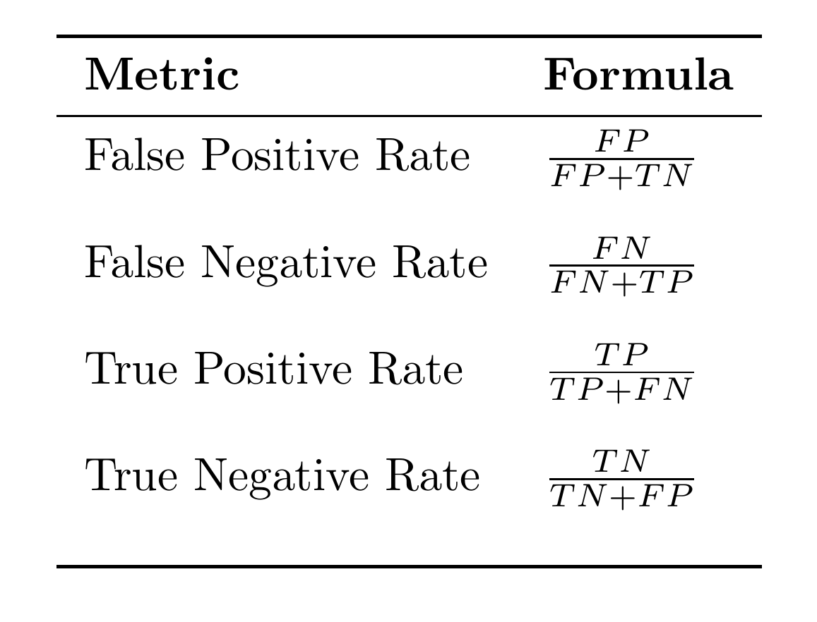
Note that \(TPR\) and \(TNR\) measure how good a classifier is in doing what it is supposed to do. They are utility functions meaning that their values must be maximised. On the other hand, \(FPR\) and \(FNR\) are cost functions meaning that their values must be minimised.
Precision/recall tradeoff
In an ideal world, we would like to have as little false positives and false negatives, thus maximising both precision and recall. Unfortunately, it’s not possible to do that. When we reduce \(FP\) and improve precision, recall takes a hit as \(FN\) goes up. In other words, for binary classifiers, precision and recall are inverseley proportional to each other.
To understand this better, we have to look at how a classifier, assigns the class. The algorithm first computes a score for each instance, and if that score is grrater than a preset threshold, then the instance is assigned is positive class. Generally, a higher threshold improves precision and worsens recall. The variation of precision and recall with threshold is shown in Figure 1.
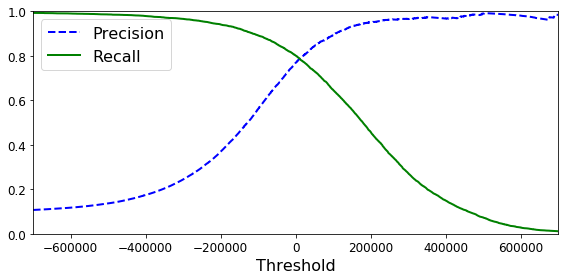
Image credit: https://datascience-george.medium.com/the-precision-recall-trade-off-aa295faba140
Clearly, we can achieve close to 100% precision by setting a threshold of 200000. However, this reduces recall to 40%. Therefore, when we are aiming to reach a a particular value of precision, say 95%, the right question to ask is “95% precision, at what recall?”. A classifier with high precision and low recall will have too many false negatives. In a diagnostic test for a highly contagious disease like COVID-19, this can have disastrous consequences.
However, there can be scenarios where a low recall is acceptable. Let’s say you are building an algorithm that classifies videos into two categories – ‘Safe for kids’ and ‘Not safe for kids’. It’s ok if such a classifier red flags many good videos, but it is expected to green flag only the good videos. Or, it can have many false negatives, but only a few false positives. This requirement translates to a classifier with high precision and low recall. On the other hand, a classifier detecting shop lifters should flag as many cases as possible, even if some of them are false alarms, but it can not afford to miss too many cases of theft. In other words, it should have low precision and high recall. Therefore, depending on the task at hand, one can choose the appropriate precision/recall tradeoff and choose the corresponding threshold from the curves shown Figure 1.
Another way to choose a good precision/tradeoff is to use a Precision-Recall Curve (see Figure 2). In the curve shown, precision begins to plumet for a recall of 80%. This suggests that it is better to choose a recall that is just before the drop (say, at 65% recall). After choosing the tradeoff, we can go back to the curves in Figure 1 and slect the corresponding threshold value.

Note that the graphs in Figures 1 and 2 are unique to the dataset and the classifier used. That means, you have to reproduce those graphs for your own dataset and every classifier your use. If you try out five classifiers in your problem, you will have ten plote (two plots for each of the five classifiers).
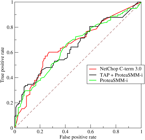
Receiver operating characteristic curve
Another useful tool in binary classification problems is the receiver operating characteristic curve (ROC Curve). It plots \(TPR\) vs \(FPR\) for a binary classifier.
By BOR at the English-language Wikipedia, CC BY-SA 3.0, https://commons.wikimedia.org/w/index.php?curid=10714489
Comparing two classifiers: Area under the curve
The area under the curve (PR or ROC) is a measure of skill of the corresponding classifier. If we are comparing two or more classifiers, then the classifier with the largest area is the best among the lot. Since the performance metrics plotted in the curves have an upper ceiling of 1, the maximum possible area under a curve is 1 itself.
We can plot PR and ROC curves for any classifier, and compute areas under them. Are both the curves equally good any dataset? It turns out that PR curves are better suited for datasets in which instances under negative class significantly outnumber those under positive class [2]. On the other hand, ROC curves are better suited for tests where both the classes are more or less evenly distributed.
References
-
Hands-on machine learning with Scikit-Learn and TensorFlow by Aurelien Geron
-
Saito T, Rehmsmeier M. The precision-recall plot is more informative than the ROC plot when evaluating binary classifiers on imbalanced datasets. PLoS One. 2015;10(3):e0118432. Published 2015 Mar 4. doi:10.1371/journal.pone.0118432